OUR FAVOURITE BEFORE AND AFTER PROJECT TRANSFORMATIONS
Hello and welcome back to another blog! We take a look back at previous projects in the hope to inspire your interiors and share a number of challenges we faced, and how we overcame them. If you have interior questions or would like help solving your particular home design, we’d love to answer them in another blog or through private consultation, which you can book here.
Let’s jump right into the first project…

KENTISH TOWN
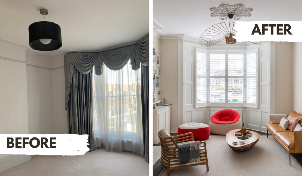
Here, we were asked to completely redesign and redecorate our clients’ space within just three weeks. Requiring plenty of full-scale reconstruction, it was safe to say that we had our work cut out for us!
Because the original state of the house design was so totally different to the new one (it began as a darker, moodier design and was to be made more bright and midcentury in style), we had very little time for sourcing, and could not rely on existing pieces to help us. The only large part of the building we could reuse was the floor, which was at the time painted a crisp white. To create a softer, more traditional look, we sanded the floorboards down and found that they were a very beautiful mahogany tone, so this helped us significantly!
In addition, we were also asked to update the kitchen and create a walk-in wardrobe, and turn the then existing walk-in wardrobe into an office.
The way we handled this was we decided early on that a light, breezy colour scheme would be best. The clients wanted fun, standout pieces of furniture, and to let these things shine we wanted our paint choices to be uncontroversial, and to act as a neutral background for more interest throughout the room. The clients were also brilliant in terms of providing clear tastes when it came to sourcing and redecoration for the kitchen, walk-in wardrobe and office, our lives were made significantly easier.
This is why when you go for a design consultation, it is extremely helpful to come in knowing what you like (and what you don’t), as this reduces the amount of revisions that need to be made. Revisions of course are absolutely necessary occasionally and often encouraged, but they do take time, so with a 3 week project we try to avoid this as much as we can (and we do think this is a large reason why we managed to turn this project around so quickly!
WOODSIDE PARK
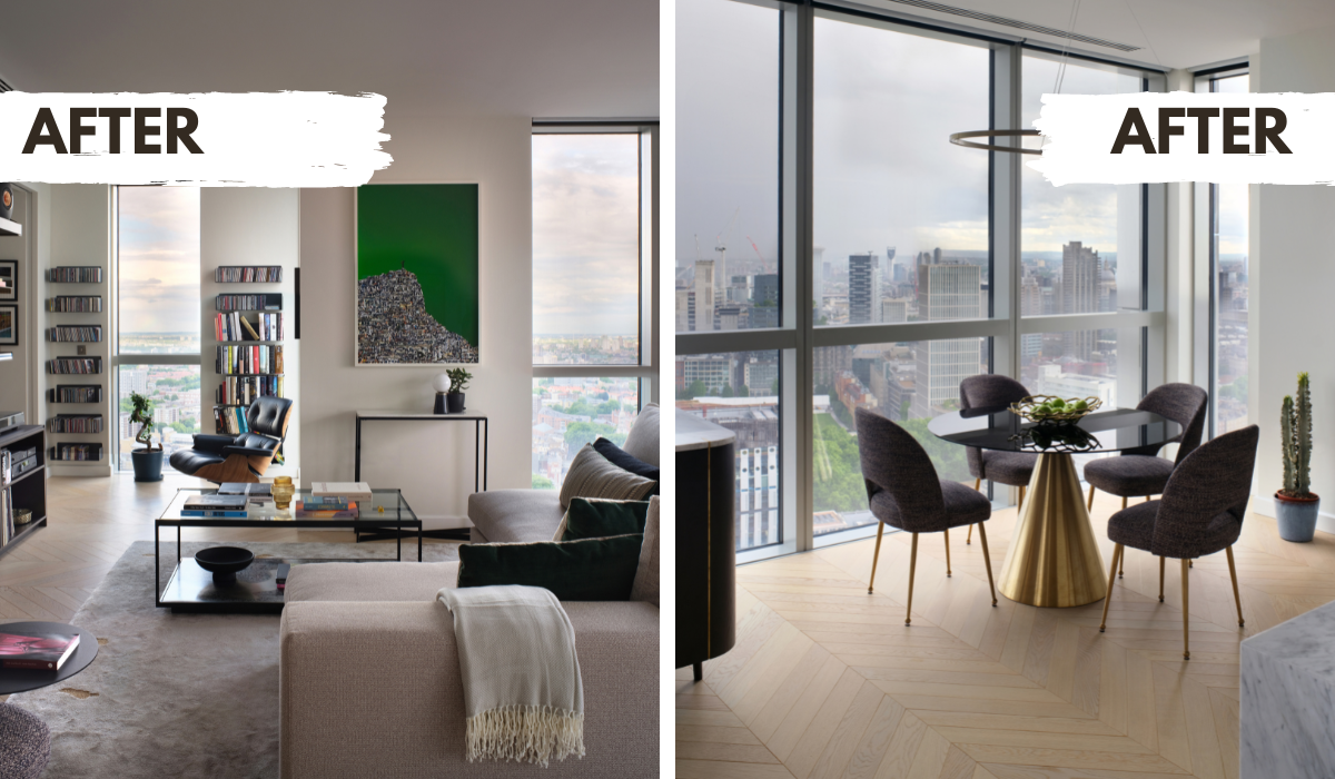
The second project we experienced challenges with was woodside park. This was for a lovely client who was undergoing some big life changes, so we had 6 weeks to change absolutely every aspect of his home, right down to the type of plates and cutlery on his table.
This was also our first project during the pandemic, so getting to grips with remote working felt particularly intimidating since part of our role is to be on-site throughout the design process.
The pandemic taught us many things (both good and bad), but, optimistically, we can now offer online consultations, and are able to do much of our work at home, allowing both us and our clients far more flexibility than ever before.
We also feel grateful to our wonderful site managers, the Cigal Kaplan Interiors Team, and contractors who were responsible for all the on-site developments throughout this project. We quite literally could not have done this without them. Interior design is a completely collaborative process, which is fundamentally the reason why we managed to complete this project so brilliantly and well within the time constraints. So, if you’re looking to become a designer or decorator, our number one tip would be to find professionals who are brilliant communicators and hard-workers – it can make or break your project (and reputation).
OLD STREET
The third project was for a client in Old street. There were two challenges faced here: firstly, it was a penthouse, so posed physical limitations, and secondly, we had to create a custom-made bookcase which posed a few issues, to say the least!
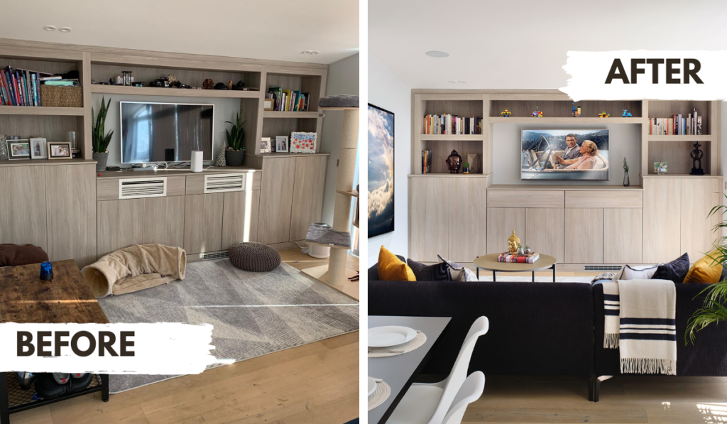
To begin with, the bookshelf inherently had its challenges, since this piece was a) massive, and b) had to be designed (collaboratively) and manufactured in Greece. This allowed us to keep costs down, plus the company specialised in shelving to hide electrical equipment. This was key for our client: as an avid music listener and film-watcher, they wanted to display their electricals while hiding all the necessary but ugly wiring required. We, therefore, designed a bookshelf which hid all this and created a gorgeous, sleek focal point within the space.
This project taught us that we had to be completely on the ball with measurements, and hire brilliant workmen and tradespeople to install and collaborate with our design process.
Along the way we also learned a huge amount about the legalities and practices of designing a penthouse (and more importantly, we learned how to get your items in the actual space!) – and we feel confident that next time this will be a much less daunting task for us. We learned to always ask suppliers what their rules are for the delivery of products, and in this case, specifically, how many flights of stairs they will go up, and how much they charge for this service (if at all). You don’t want any nasty surprises (aka, massive bills) for you or your client!

This last project also taught us about the importance of getting a second opinion (particularly when it comes to your home’s architecture!). We as designers know everything about how to create your dream home, in the context of how your house is now. However, we are not architects – and so whenever we’re designing a property, we hire a number of different contractors to assess the building structurally and to see what needs to be improved or changed.
In this case, the building needed far more intense renovations than we originally thought, but because we managed to hire professionals to assess the property before getting to work, we managed to avoid huge inconveniences before they occurred.
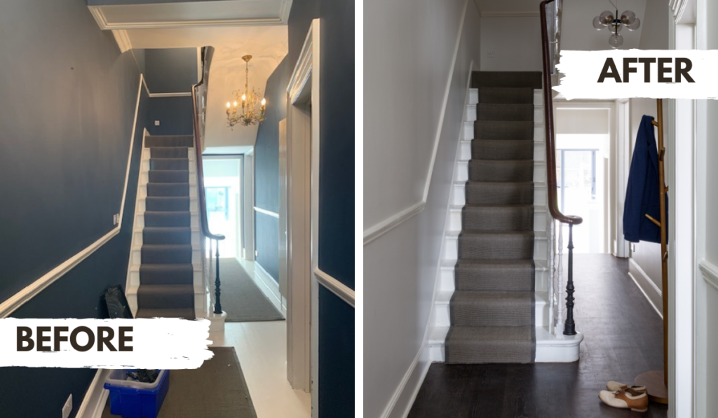
Upon the second inspection, we were forced to completely redo the entire staircase from the bottom to the top floor. We had originally intended to redecorate this area, but we did not anticipate completely redesigning and rebuilding such an integral part of the property. Luckily our clients were able to accommodate this within their budget, and it ended up being a beautiful detail of the house.


